
ODU Launches First Wave of Website Redesign
November 4, 2022
Making the transition from one web platform to another is a lot like moving houses. It can be near flawless or disastrously executed. Old Dominion University is in the midst of moving virtual houses to a new content management system (CMS) for their home website.
What is a CMS? Essentially, it’s a program that allows a user to modify a web page without having to do any coding. It’s convenient because a lot of people either don’t have the time or patience to learn HTML, which is used to make modifications for things as simple as a 2009 Tumblr page.
Back in the year everyone remembers fondly, 2020, ODU spoke about its ambitions to change its CMS provider from Adobe Experience Manager to Drupal, a free and open-source CMS. Open-source means that any users with the license can make modifications to the coding and redistribute it accordingly. This does wonders for keeping the source code flexible and up-to-date. Of course, Drupal’s flexibility is wholly dependent on the user’s coding skill level. Plenty of notable sites use Drupal, such as NASA, Tesla, Oxford University and Grammy.com (which was formerly a music oriented site). It’s an impressive feat for a CMS and shows that Drupal is not without merit.
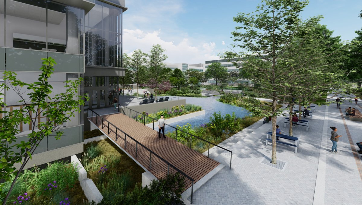
Of course, moving the entire site at once would be a massive undertaking. ODU has decided to release the new design in waves. During the week of October 31st, ODU released the first wave of new designs for many different webpages. Their goals were to improve user optimization, to make the sites captivating, and to remove the labyrinthine experience of trying to find a specific page.
Any form of migration on this scale will not be completely flawless. Different screen sizes and orientations are just one of many wrenches that can be thrown at a sophisticated site’s source code. This is especially true for mobile devices since viewing the site in landscape or portrait mode orientation can make the page dance like a 90s breakdancer. Despite ODU creating focus groups and speaking with stakeholders, faculty, staff and students, the redesign has not managed to avoid these problems.
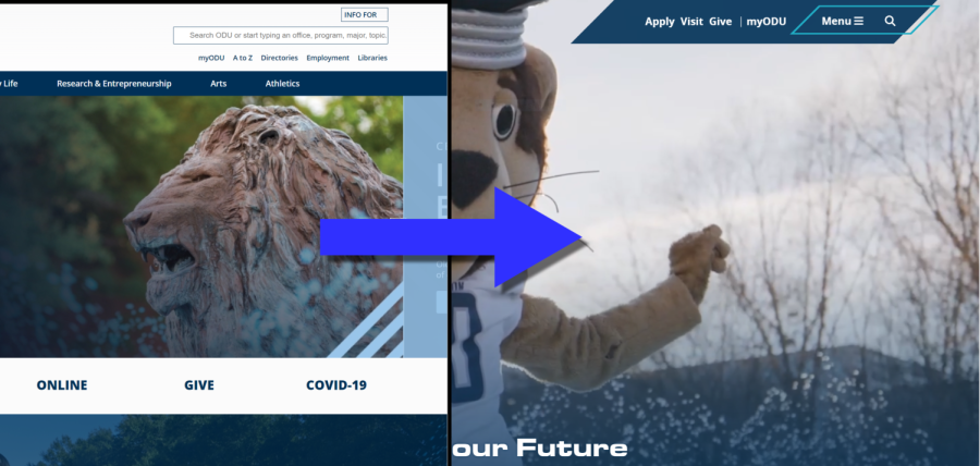
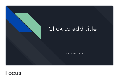
Now on to the designs. The new look does present a more modern approach but it’s hard to ignore all the sharp corners and excessive trapezoids in the new iteration of the main page. In a way, it’s reminiscent of the “Focus” theme on Google Slides.
A simple comparison can be done using the Wayback Machine, a handy site that preserves how a web page looked in the past. The new main page is definitely larger and has much more content than the original page. There’s a lot going on in the background, including video. On the mobile version of the new main page, certain pieces of text jump on top of each other instead of remaining separate and readable. From the looks of many redesigned pages, it seems as if certain images and blocks of text were placed over others to produce a 3D shadow effect. However, this can affect how text is displayed since it might overlap depending on the size of the screen and its orientation.
The Web Redesign Project team aimed to make mobile usage the primary focus of optimization and user-friendliness. Whatever the reason for this decision, it’s not an easy task to take on considering how there are many different cell phones and mobile devices that have different screen sizes. As for user optimization, a case could be made for either side regarding how both the new and old designs attempt to avoid information overload. Sometimes, sites and even the drop down menu can look cluttered with text that seems to mix together. There are also some blocks of text in the update that have an awkward scroll bar on them.
Previously mentioned websites like Oxford University or Tesla hinge on a less-is-more approach. While there are many pages that got a full makeover, the main page probably has the most action going on, which may or may not be a problem to students and parents who aren’t even remotely familiar with ODU’s website layout. What can be appreciated from the former main page is that everything was easy to access without additional clicking. The video in the new design is certainly eye-catching and it seems to be the pièce de résistance of the main page. However, all the extra content tends to drown the video out. For example, a high school senior focused on trying to apply will probably scroll down only to realize the “Your Future Starts Here” button was the actual shortcut to get there.
On a positive note, a lot of the awkward negative space in certain pages was eliminated. Not all pages have received a full makeover, but they will in the upcoming waves, which have yet to be dated. The new header and footer look much better than the former but I think a bar would look better than two polygons sticking out from the sides. The darker color scheme was a welcome change and makes everything pop out more. The contrasting colors are a big improvement over the former lighter color scale.
Feel free to share your comments or thoughts about the page. Regardless of if you like or dislike the new design, it’s important to email webredesign@odu.edu to point out any page-breaking errors or provide feedback.